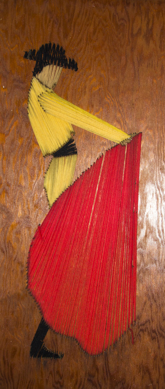
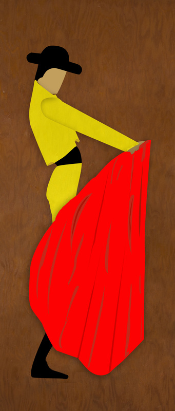
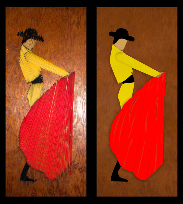
I would like to use this post to plug a website for a freelance photographer/graphic designer's website.

This website is for J. Michael Design, "a small company providing graphic design and photography services to both small businesses and large corporations since 2010." I personally know the the photographer, Jason Laliberte, and have shot photos at a few events alongside him. Taken from his website...
My name is Jason Laliberte, an enthusiastic and detailed Graphic Designer and Photographer.  Design and Photography have long been my two passions as they allow me to use my imagination to it's full potential and put my creative mind to work.  My speciality is coupling attention grabbing headlines, informative copy and eye-catching imagery together to create a wide variety of artwork across a diverse media portfolio. My concentration is aimed at creating design solutions for companies of all sizes that drive retention and increase campaign effectiveness; focused on engaging viewers, educating current and potential customers, and increasing customer traffic and interaction.  Effectively communicating and collaborating with my clients, multi-tasking between projects, maintaining high quality standards while adhering to strict deadlines and budgets are proven strengths of mine as a small business owner that I would like to bring to your next design/photography project.

Major clients include: 3M Purification Inc., NEJ Inc., CrossFit Reckoning, The Music Learning Center, Inc. and the WCSU HPX Club.  J. Michael Design is fully licensed and taxed by the State of Connecticut.
Jason is very passionate about his work and it is immediately obvious upon meeting him. If you want work done by someone who truly cares about every single project he is working on, J. Michael Design is the place to go.

His website also has a few photos of yours truly, so if nothing else convinced you to check out his website, a chance to gaze at the glory that is a photograph of me should be enough to convince you.
Picture
Yes, I know. I'm gorgeous.
 
Today I decided to experiment with the pen tool in Photoshop. For those who are familiar with the pen tool, you may be wondering why someone who has used Photoshop for years, is just getting around to experimenting with it. Well for one thing, I've never really needed it, and to be honest, I'm terrible with it. However, I decided enough was enough and gave myself a little project. I was going to make my own digital version of this yarn matador that my father made when he was at a much younger age than myself.

So I started off using the pen tool on the red cape thingy that the matador uses. I then filled it with a solid red color and moved on to doing the same with the hand, the boot, the face, and the hat with the different color. Each one of these was on a different layer. I then did the arm and the torso separately, and finished the rest of the separate pieces.

From there I decided that I cannot have all of this be a fresh, new look while leaving the same photo of the wooden backboard as the background. So I went back to the original layer and copied it (never delete the original background layer until you are absolutely sure you are finished!) and then went about filling in the background completely with the wood backboard (basically covering up the matador as if it never existed), as well as getting rid of the washed out side that resulted from my camera's flash. 

Okay, so from there I had a full backboard to work with as if the yarn matador was never even put there. I made a new layer and filled it with a shade of brown...but I decided I still wanted the texture of wood to be on the backboard. To do this, I made the filled-in layer semi-transparent, and then copied it one more time to double up the color and make it a little more opaque. Below is the before and after shot of the backboard.

Next I made the matador visible again...
Now that I was looking at the entire thing, I couldn't leave the matador as a bunch of solid colors while the background had some texture to it...so I tried making the yellow jacket/pants, and the red cape/blanket slightly transparent so that the direction of the strings of yarn would give it a slight texture...
Unfortunately, it didn't give it the look that I was hoping for. Besides, if you click on the picture to view a larger version, you may see that along the edges, the nails holding the yarn are visible through the colors. Kinda tacky don't you think (no pun intended)?

So I decided to make them fully opaque and add my own textures manually with the pen tool and the fill command. I liked the end result (not perfect but it was copacetic enough), however I felt that it still looked flat. To fix this problem I added a drop shadow to a few of the layers and rearranged the order of the layers so the jacket was on top of the skin, and the red cape/blanket was the uppermost layer.
If you look closely, you will see that the arm has a shadow over it. This was a result of the order of my layers (the torso layer is above the arm), but when I reversed it, it looked messy. 

When I originally created the two separate layers, there was a slight gap in between them that allowed the photograph underneath it to peak through. To compensate for the gap, I just smudged some of the yellow in the arm over the gap because I knew that the jacket layer would cover it up. So if I reversed the layer order now, there would be a bunch of messy yellow lines coming out of the arm, leaving messy shadows over the torso...this is a small flaw in my work, but one that won't really matter to most people unless they are graphic design pros.


There you have it: the original piece of work, and the final result of my experimenting.