As usual, I am far behind with uploading photos. I took these before Halloween but am just getting to them.
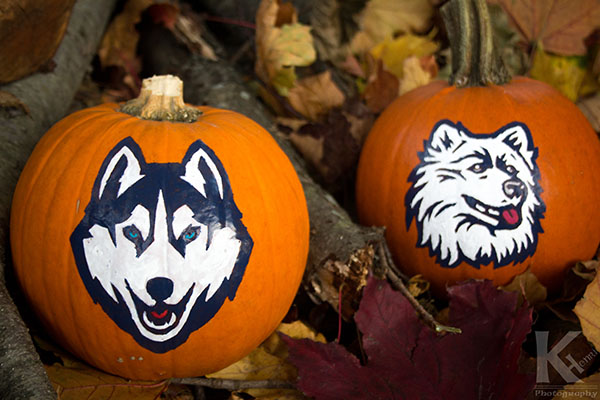
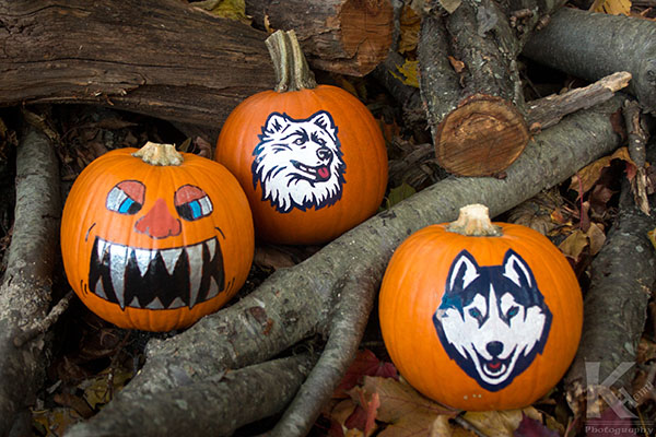
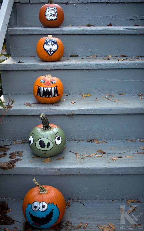
Last year, my friend Tim, brought over a bunch of pumpkins to paint and deliver to a local Assisted-Living center for the elderly. I thoroughly enjoyed it, so I decided to paint some pumpkins for my own selfish enjoyment. 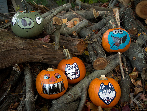 My friends did the angry birds pumpkin and Cookie Monster pumpkin.
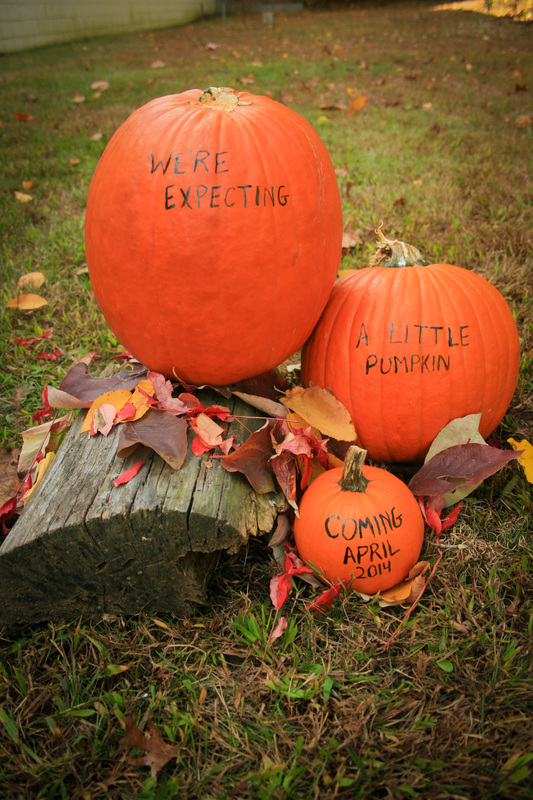
So a couple months back, my brother delivered news to me that his wife was pregnant. It was very exciting news, and continues to be, because besides welcome a new family member soon, it will be the first-born of the next generation of our family and I will become an uncle for the first time. So after she was pregnant for three months, they decided it was time to announce it to everyone they knew. My sister-in-law saw a photo on Pinterest that she liked and asked if I could make a related photo for them to use to announce her pregnancy. I agreed to, so they bought some pumpkins and painted some words on them and we headed outside to find a spot to set them up and hopefully capture the autumn feel that accompanies pumpkins. This was roughly a month ago, so the leaves were just beginning to change color so we did not have the full range of colors of leaves to select from. As we were walking along, I saw a random block of wood laying on the ground and grabbed it for the photo. Overall, I'm pretty happy with the way the photos turned out. Here's a few of them. The first one is the one they used because they wanted one in landscape orientation so they could set it as their cover photo. My personal favorite is the last of the three here.
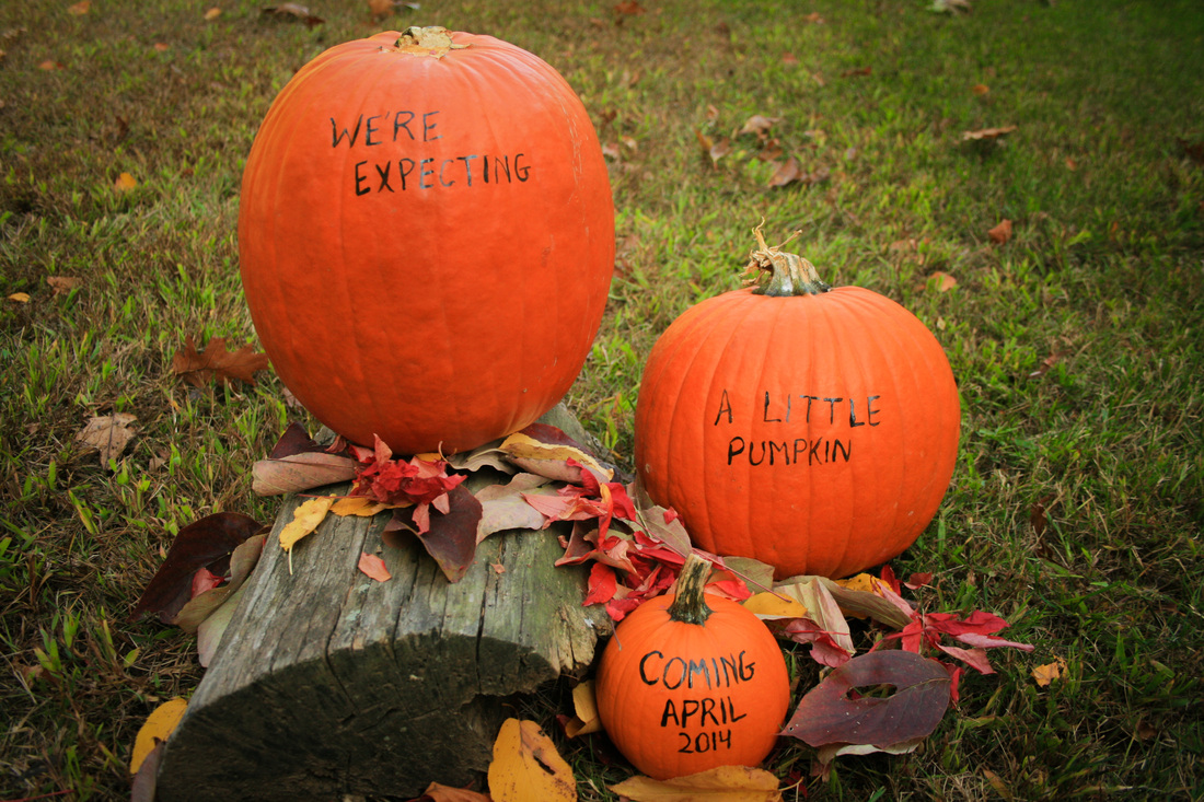
This is the one that they used.
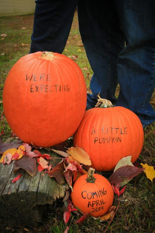
We tried one with their legs in the background.
If you like the post, don't be afraid to comment and let me know who's reading! :)
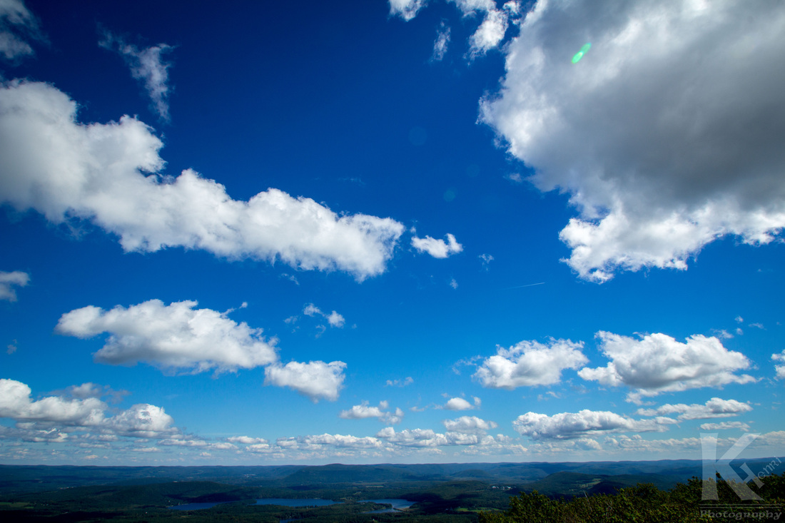
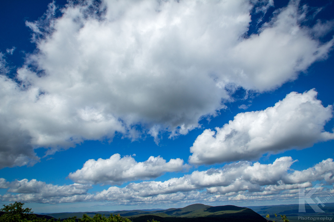
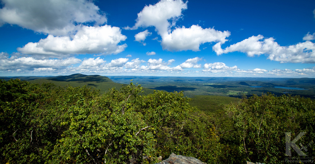
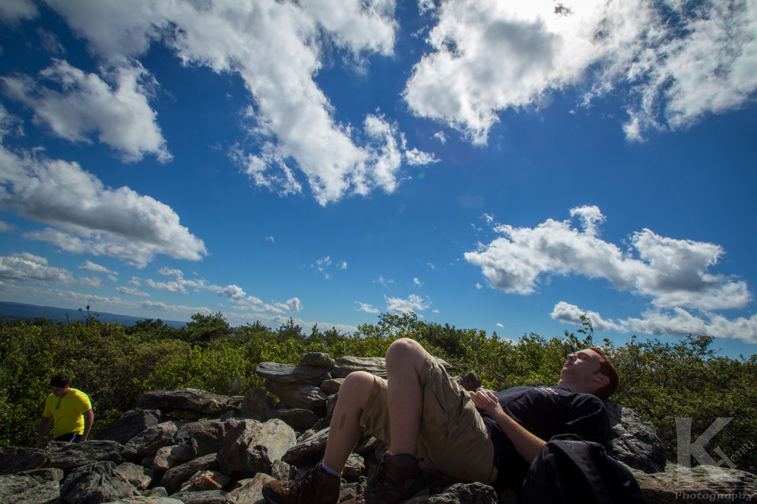 Yours truly taking a much-needed break. In late August, I decided to go on a hike on a portion of the Appalachian Trail with some friends to the top of Bear Mountain in Salisbury, Connecticut. It is the highest peak in the state. My friends had not hiked any part of the Appalachian Trail before, and one of them had never gone on such a tough hike so away we went. Now, this may not be a tough hike for everyone, but believe me when I say, there were quite a few times I was having second, third, fourth, and fifth thoughts...and I've hiked this mountain two times previously, so you'd think I knew what I was in for! Anyway, after a couple hours, and five minutes of hiking part of the trail that cut into Massachusetts, and a very close run-in with a copperhead snake (although rarely fatal, the bite can be extremely painful and do some serious damage), we reached the peak of the mountain. Phew! I was beyond exhausted from the hike. Thankfully, it was a gorgeous day outside, and with the strong wind blowing, I quickly cooled off. As you can see from the photos, the sky was incredible that day, as well as the view. I think that a lot of people would be surprised that you do not need to leave Connecticut in order to get great views of nature. However, there is no road leading up to this view, so you need to work up a sweat...or two... in order to get to this vista. But as anyone who enjoys hiking will confirm, the struggle makes the view all the more amazing. It really helps you appreciate the view, knowing that people cannot just hop into a car and cruise up there on a whim. 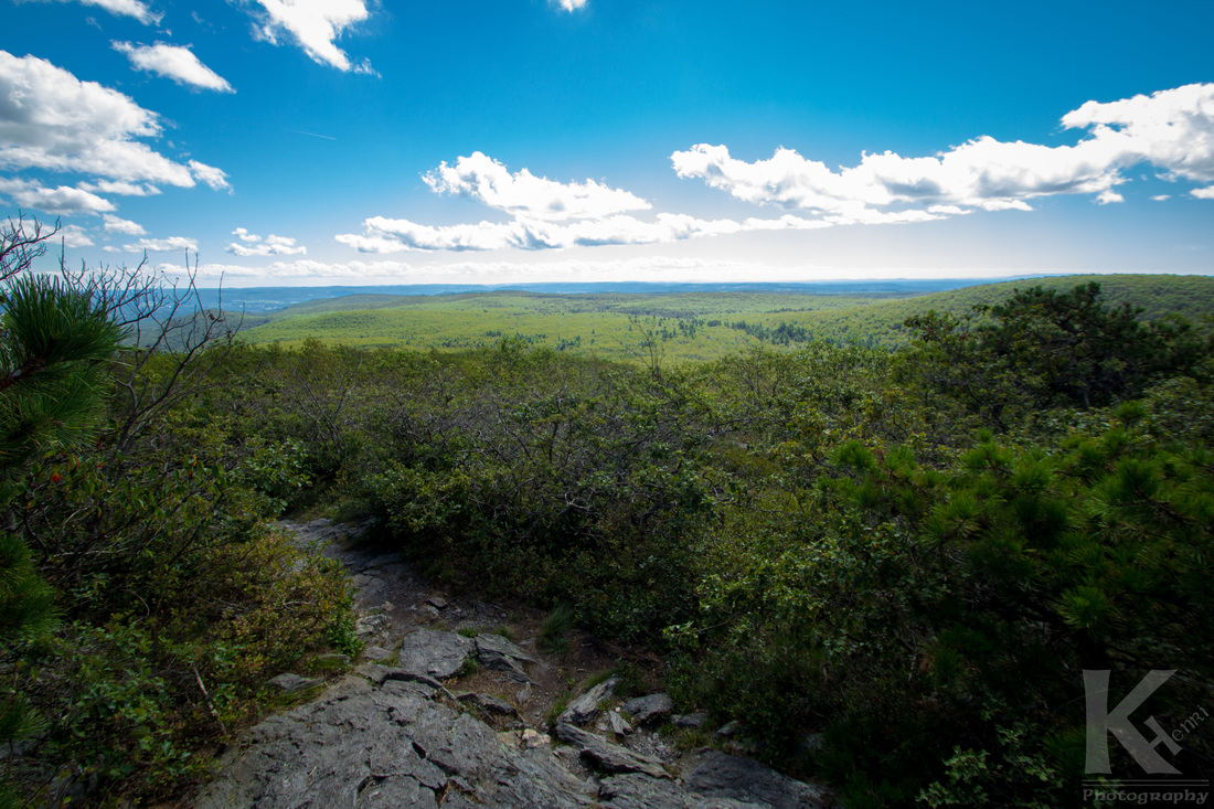 The beginning of the descent. Note to self: Do some more hiking in preparation for the next time you attempt this.
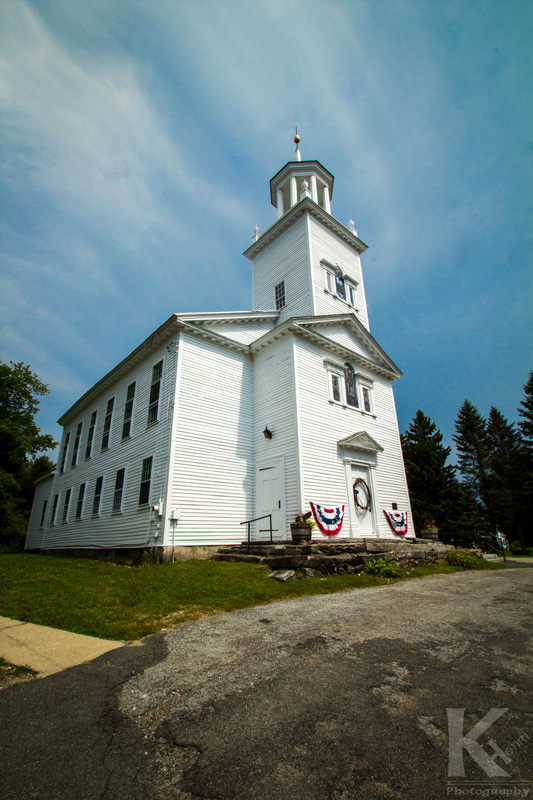
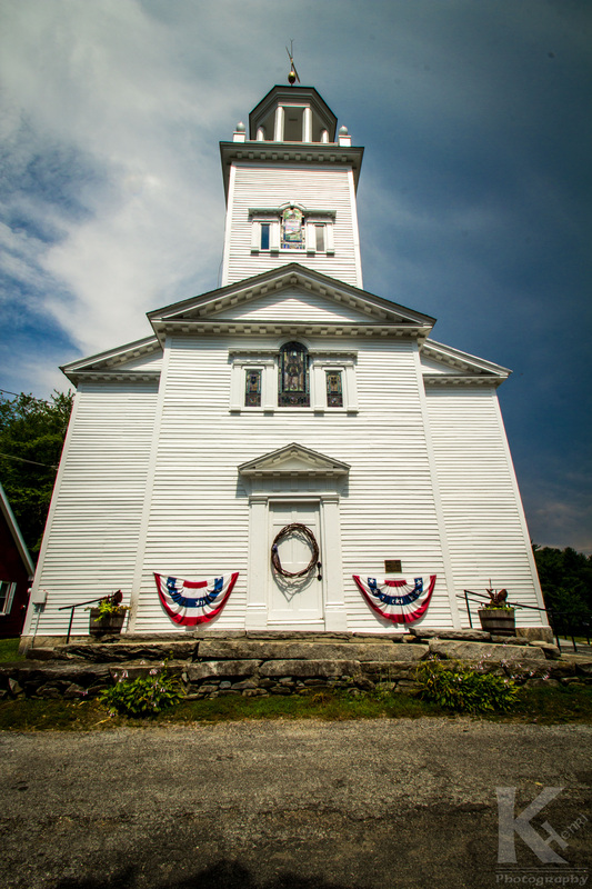
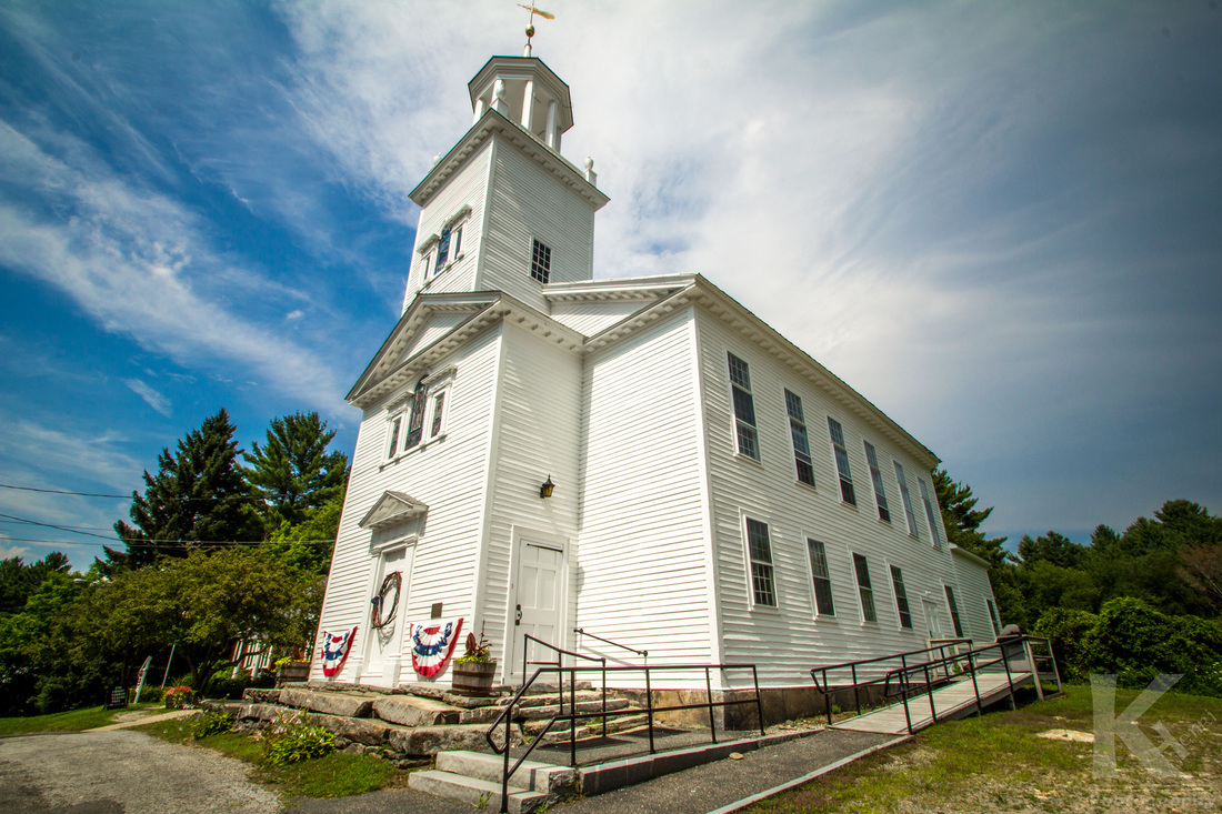
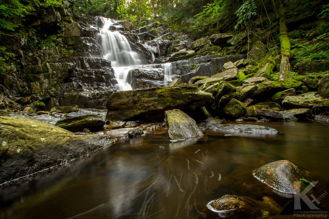
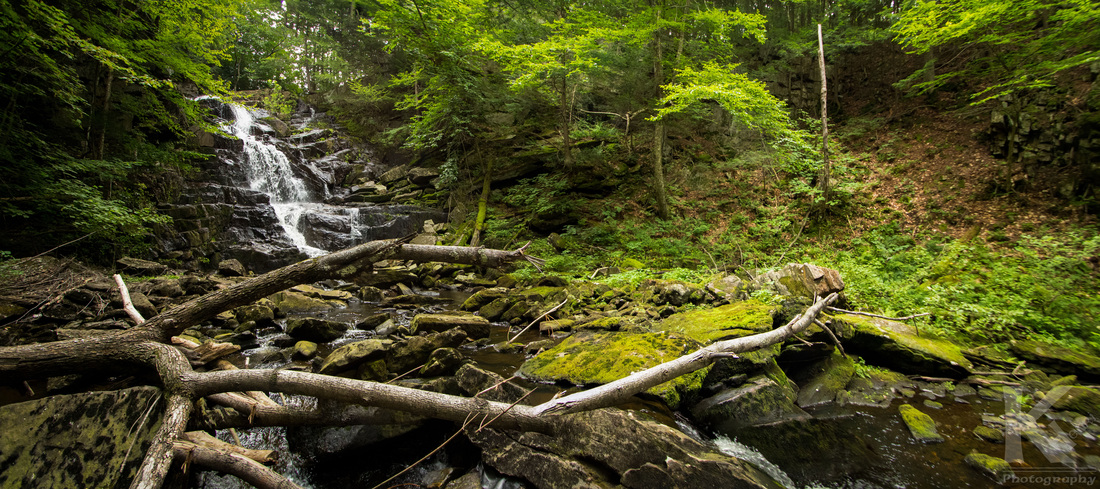
Over the summer, my uncle invited me up to go camping in Otis, Massachusetts. Being New England, a trip through Massachusetts was not complete without some photos of a white church. 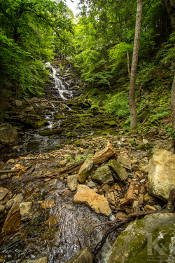
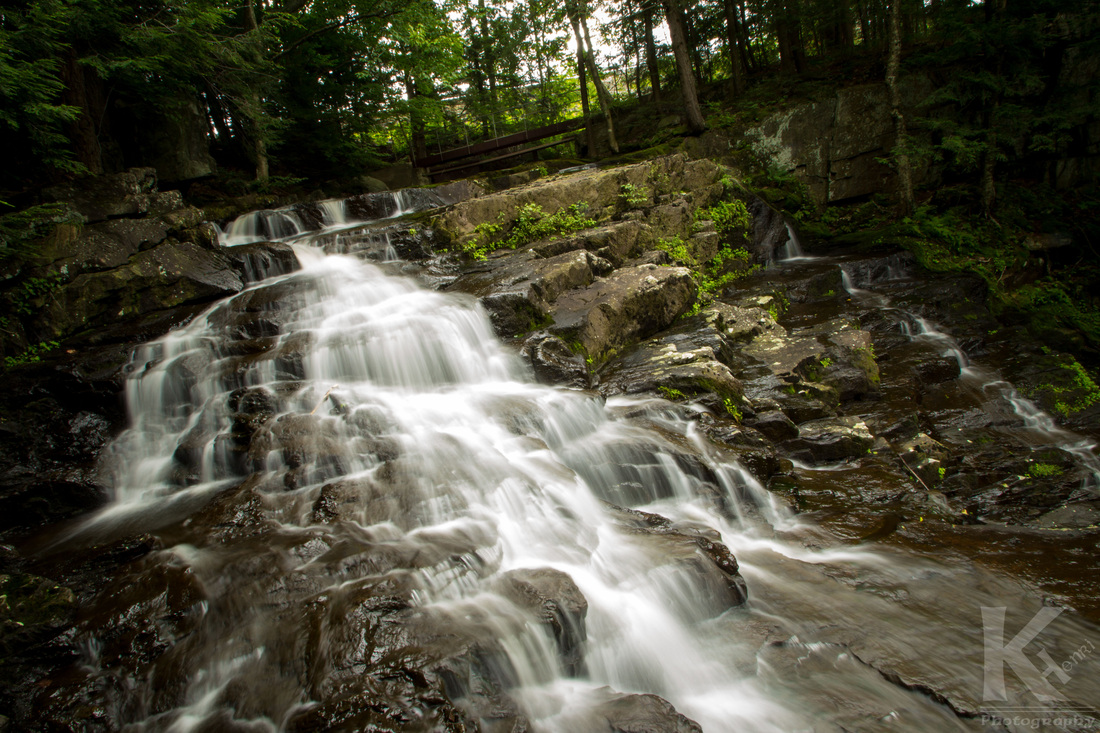
And of course, since I was camping, I had to throw in some nature exploration as well.
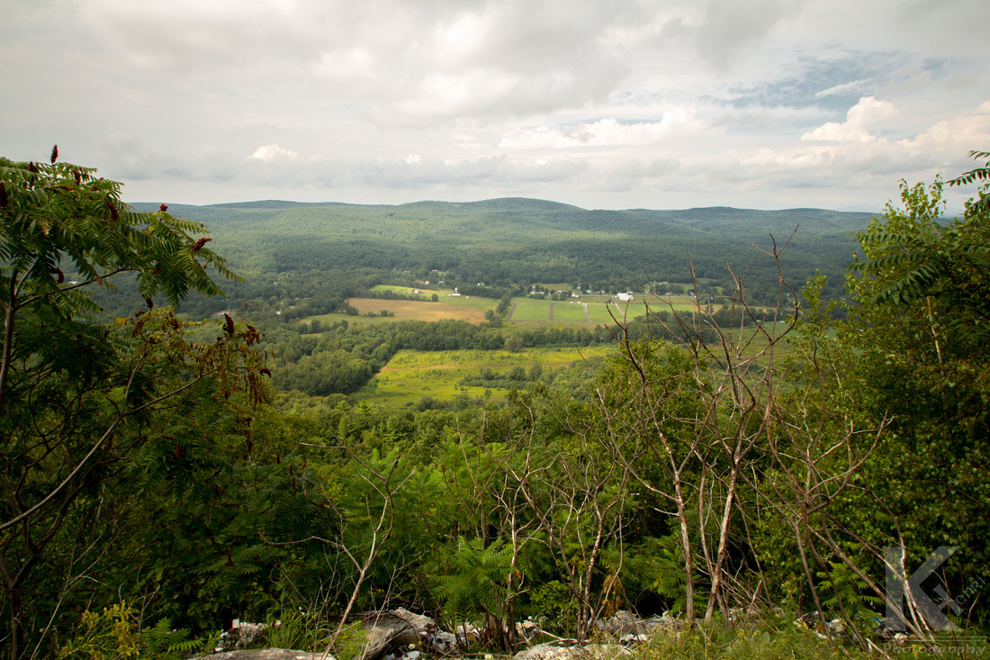
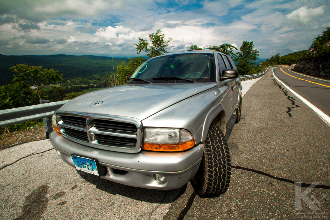
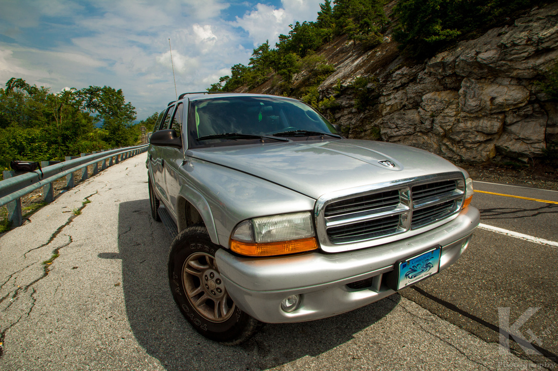
A couple weeks later, a friend invited me to go camping in Ellenville, New York. As I was heading home, I had to drive up a steep mountain in the Catskills and pulled over to a vista that overlooked the town. I couldn't resist taking a couple photos of my Durango while I was stopped.
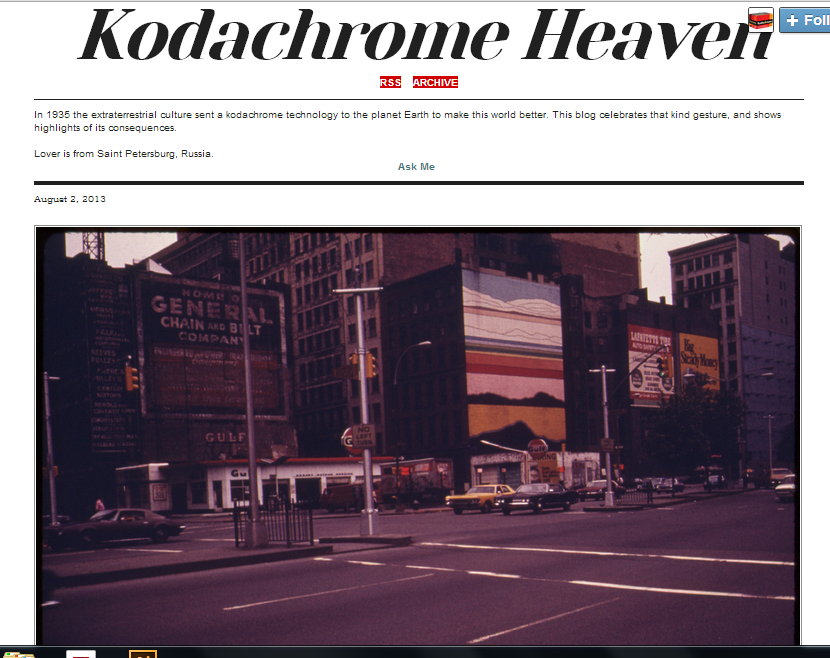
I found this blog today while surfing the internet and I have to say I am a big fan. There is not much on it, so you can quickly look at all the posts in a matter of minutes. The blog is called “ The Color Out of Space” and is dedicated to Kodachrome, a discontinued film that has arguably, some of the best colors film could produce. According to its Wikipedia page... Kodachrome was the first color film that used a subtractive color method to be successfully mass-marketed. Previous materials, such as Autochrome and Dufaycolor, had used the additive screenplate methods. Until its discontinuation, Kodachrome was the oldest surviving brand of color film. It was manufactured for 74 years in various formats to suit still and motion picturecameras, including 8 mm, Super 8, 16 mm for movies (exclusively through Eastman Kodak), and 35 mm for movies (exclusively through Technicolor Corp as "Technicolor Monopack") and 35 mm,120, 110, 126, 828 and large format for still photography.
Kodachrome is appreciated in the archival and professional market for its dark-storage longevity. Because of these qualities, it was used by professional photographers like Steve McCurry, Peter Guttman[3] and Alex Webb. McCurry used Kodachrome for his well-known 1984 portrait of Sharbat Gula, the "Afghan Girl" for the National Geographic magazine.[4]
Kodachome has always had some emotional effect on me that draws me into each photo, even when they aren’t really good photos. I am sure part of it is that most Kodachrome photographs I come across on the internet were taken before I was born. I feel transported back in time, to a different world. I enjoy looking at all photos, however I notice that I definitely spend more time looking at a photo when it was taken with Kodachrome. The discontinuation of Kodachrome film has been mourned by many photography enthusiasts, including those who never had the chance to try it out, myself being among those. Photographer Steve McCurry used the last produced roll of Kodachrome and took photos in India and NYC. They can be found here. It's a real shame that there has yet to be a good alternative to getting the Kodachrome look, without spending an amount of time in Photoshop. Paul Simon, and most photography enthusiasts, will agree with me... What do you think of Kodachrome? Is there a good way to achieve the look of Kodachrome digitally? Please share it in the comments below.
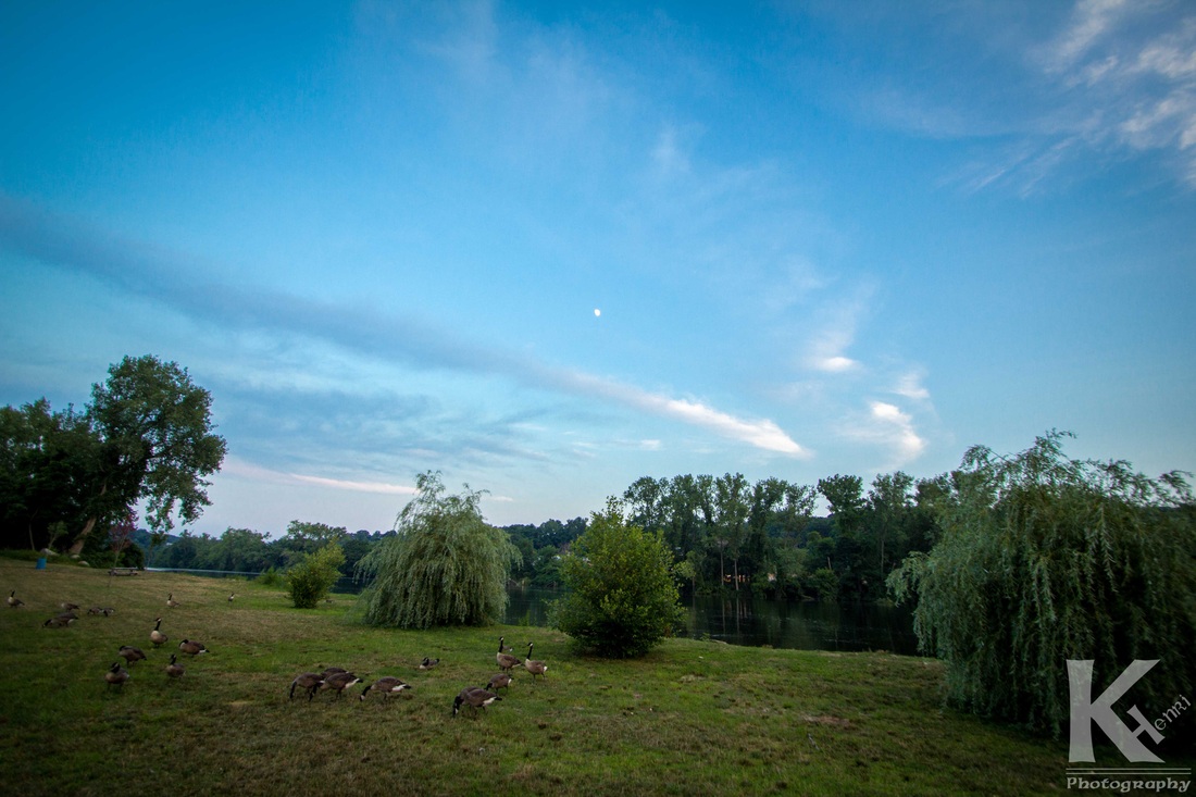
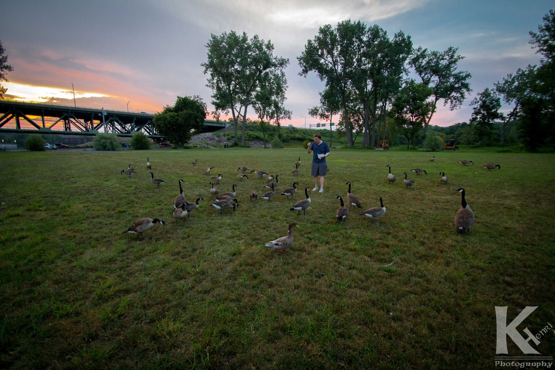
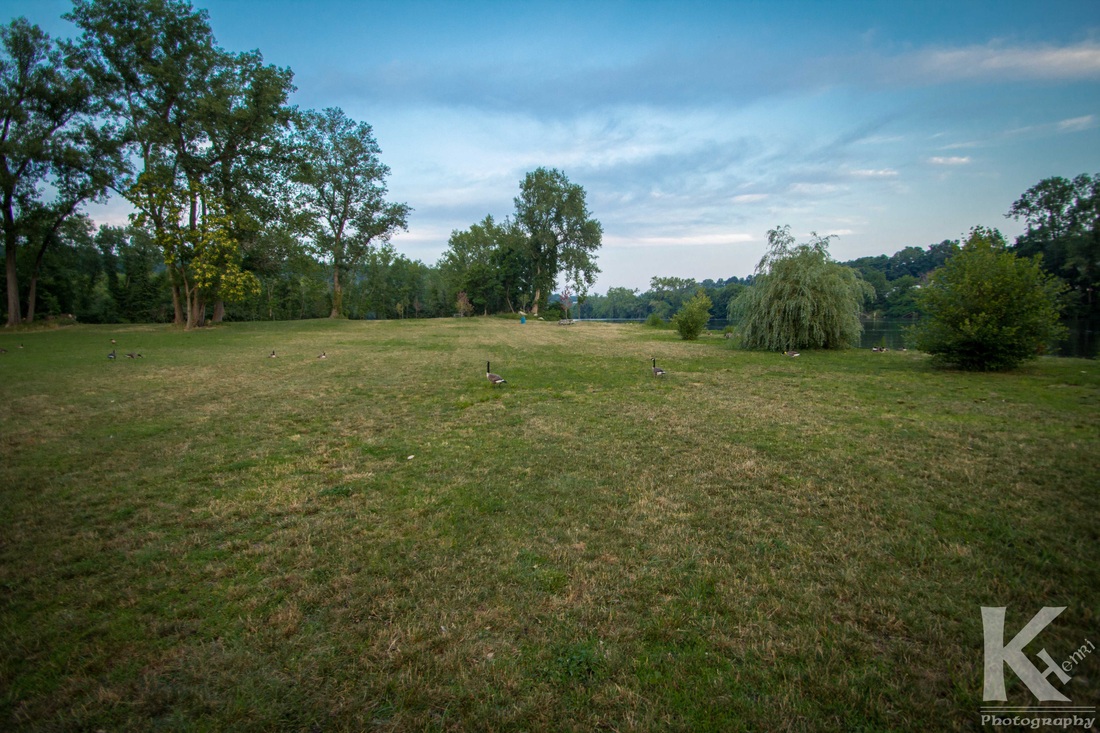
 The Riverwalk pre-geese. The Riverwalk pre-geese. The other week the weather was nice and I wanted to try out a new wide-angle Tamron lens I had purchased, so I invited my friend Tim down to the Derby Riverwalk. The Derby Riverwalk is a park at the confluence of the Housatonic and Naugatuck Rivers in Derby, Connecticut. For those who know me, they know that I am already a big fan of my hometown to begin with, but this is one of my favorite parts of my city. Anyway, Tim showed up with some pizza and decided to feed the mob of Canadian geese that were hanging out there. It made me a little nervous since I was walking around in sandals and so my toes were prime targets for a goose beak.
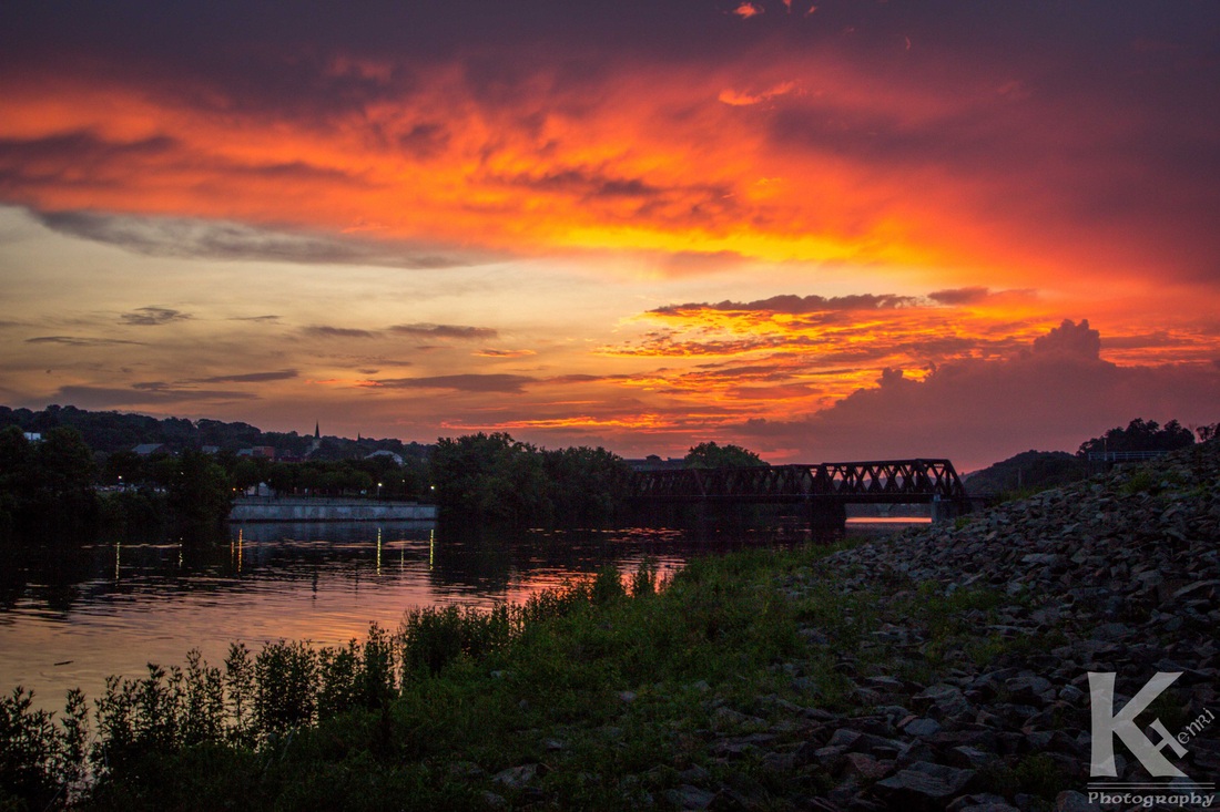
Anyway, I grabbed a few photos of him feeding the geese and then I noticed that the sunset was quite colorful so I strolled underneath the Commodore Hull Rt. 8 bridge to go see if I could get a better view of it. Luckily I could.
Please note that the photos have been edited, but only to match the way it looked in person. I basically just darkened the sky and lightened the foreground to reduce some of the contrast that comes about when taking photos of sunsets. Please enjoy and feel free to comment on the post.
Surprisingly, Connecticut has some nice weather on occasion!
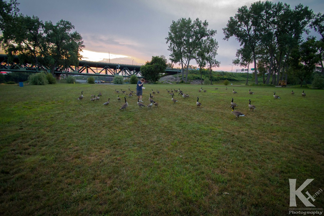
The geese onslaught.
The geese onslaught
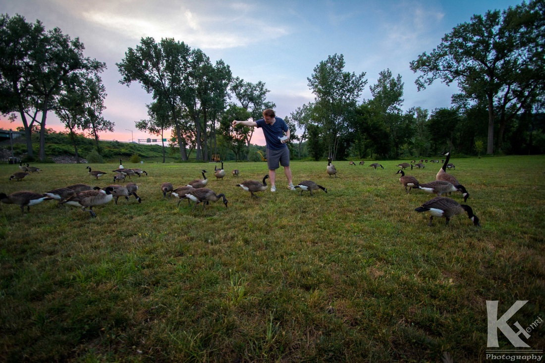
The geese onslaught
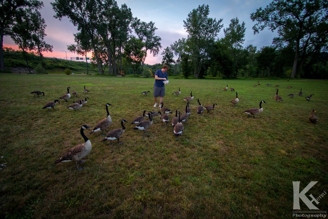
The geese onslaught
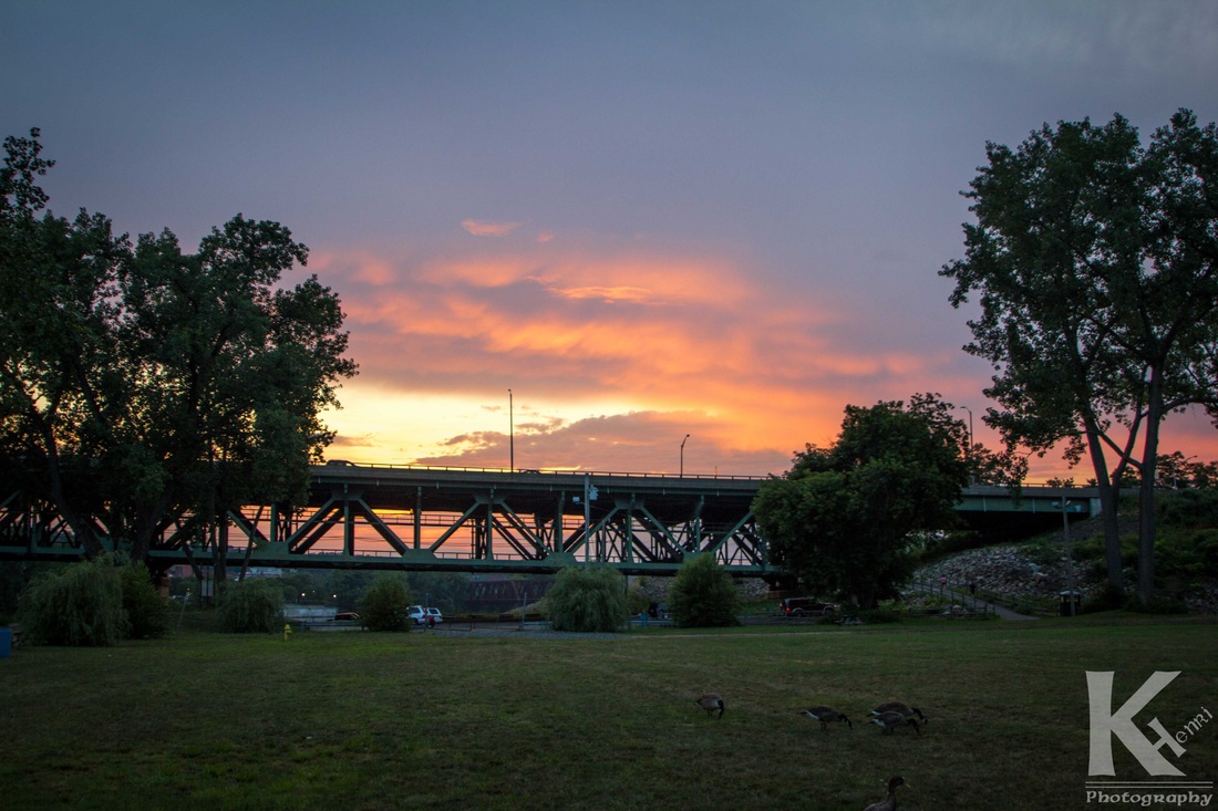
First glimpse of the sunset.
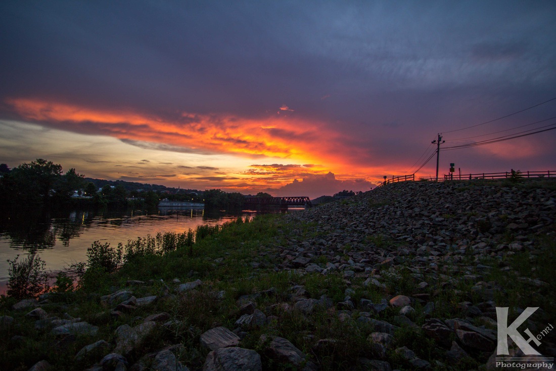
The sun setting over the Housatonic and Shelton, CT.
So I've been toying around with a photography logo for some time now. I needed one to be able to put on photo release forms, as well as watermarks on my photos. I've been mulling it over and decided to work on a design I came up with many years ago in grade school. It was very simple. Just the letter K with an H drawn attached to the inside right leg. I took that and put the H on the outside of the leg and added my name to it. Initially I made a basic one on illustrator to picture what it'd look like put together. From there I went back and screwed around with a few fonts to find a combination I would like. I ended up going with three different Celtic/Gaelic fonts, since I've always been partial to them to begin with. The 'K' and 'H' are one font, the 'enri' is another, and 'photography' is the final font. So now I have the logo that is at the top of this post. I will likely return to it in the future and change the font again, but for now I at least have a watermark I can use on my photos instead of a simple "K Henri" text.
The downside to this website is that with the free account, I cannot customize the pre-made formats as much, so I cannot upload my logo to the header without subscribing to a paid version.
I would like to use this post to plug a website for a freelance photographer/graphic designer's website. This website is for J. Michael Design, "a small company providing graphic design and photography services to both small businesses and large corporations since 2010." I personally know the the photographer, Jason Laliberte, and have shot photos at a few events alongside him. Taken from his website... My name is Jason Laliberte, an enthusiastic and detailed Graphic Designer and Photographer. Design and Photography have long been my two passions as they allow me to use my imagination to it's full potential and put my creative mind to work. My speciality is coupling attention grabbing headlines, informative copy and eye-catching imagery together to create a wide variety of artwork across a diverse media portfolio. My concentration is aimed at creating design solutions for companies of all sizes that drive retention and increase campaign effectiveness; focused on engaging viewers, educating current and potential customers, and increasing customer traffic and interaction. Effectively communicating and collaborating with my clients, multi-tasking between projects, maintaining high quality standards while adhering to strict deadlines and budgets are proven strengths of mine as a small business owner that I would like to bring to your next design/photography project.
Major clients include: 3M Purification Inc., NEJ Inc., CrossFit Reckoning, The Music Learning Center, Inc. and the WCSU HPX Club. J. Michael Design is fully licensed and taxed by the State of Connecticut.
Jason is very passionate about his work and it is immediately obvious upon meeting him. If you want work done by someone who truly cares about every single project he is working on, J. Michael Design is the place to go. His website also has a few photos of yours truly, so if nothing else convinced you to check out his website, a chance to gaze at the glory that is a photograph of me should be enough to convince you.

Yes, I know. I'm gorgeous.
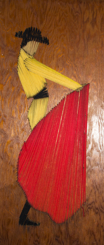
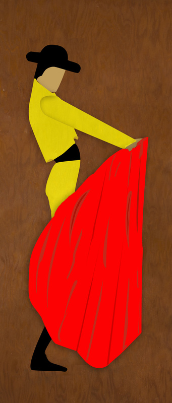
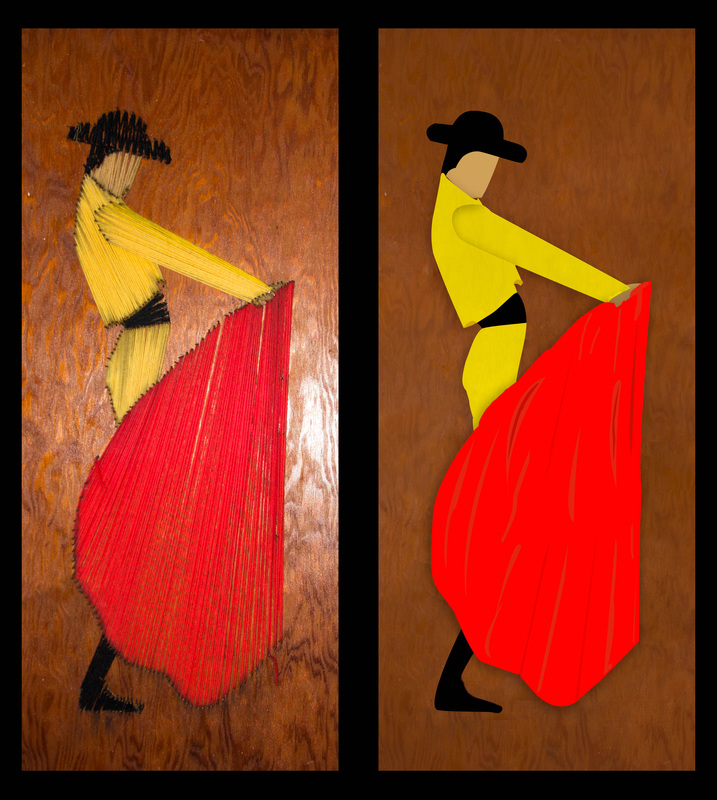
Today I decided to experiment with the pen tool in Photoshop. For those who are familiar with the pen tool, you may be wondering why someone who has used Photoshop for years, is just getting around to experimenting with it. Well for one thing, I've never really needed it, and to be honest, I'm terrible with it. However, I decided enough was enough and gave myself a little project. I was going to make my own digital version of this yarn matador that my father made when he was at a much younger age than myself.
So I started off using the pen tool on the red cape thingy that the matador uses. I then filled it with a solid red color and moved on to doing the same with the hand, the boot, the face, and the hat with the different color. Each one of these was on a different layer. I then did the arm and the torso separately, and finished the rest of the separate pieces.
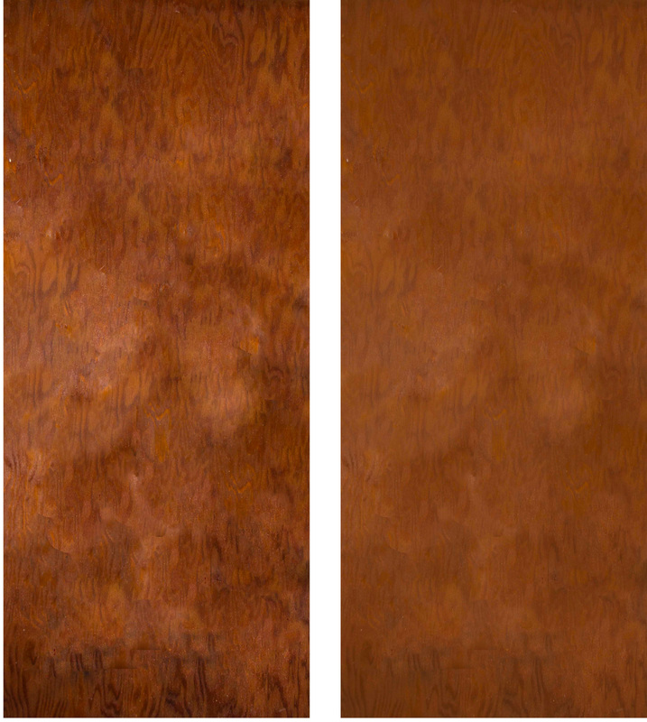
From there I decided that I cannot have all of this be a fresh, new look while leaving the same photo of the wooden backboard as the background. So I went back to the original layer and copied it (never delete the original background layer until you are absolutely sure you are finished!) and then went about filling in the background completely with the wood backboard (basically covering up the matador as if it never existed), as well as getting rid of the washed out side that resulted from my camera's flash.
Okay, so from there I had a full backboard to work with as if the yarn matador was never even put there. I made a new layer and filled it with a shade of brown...but I decided I still wanted the texture of wood to be on the backboard. To do this, I made the filled-in layer semi-transparent, and then copied it one more time to double up the color and make it a little more opaque. Below is the before and after shot of the backboard.
Next I made the matador visible again... Now that I was looking at the entire thing, I couldn't leave the matador as a bunch of solid colors while the background had some texture to it...so I tried making the yellow jacket/pants, and the red cape/blanket slightly transparent so that the direction of the strings of yarn would give it a slight texture... Unfortunately, it didn't give it the look that I was hoping for. Besides, if you click on the picture to view a larger version, you may see that along the edges, the nails holding the yarn are visible through the colors. Kinda tacky don't you think (no pun intended)?
So I decided to make them fully opaque and add my own textures manually with the pen tool and the fill command. I liked the end result (not perfect but it was copacetic enough), however I felt that it still looked flat. To fix this problem I added a drop shadow to a few of the layers and rearranged the order of the layers so the jacket was on top of the skin, and the red cape/blanket was the uppermost layer. If you look closely, you will see that the arm has a shadow over it. This was a result of the order of my layers (the torso layer is above the arm), but when I reversed it, it looked messy.
When I originally created the two separate layers, there was a slight gap in between them that allowed the photograph underneath it to peak through. To compensate for the gap, I just smudged some of the yellow in the arm over the gap because I knew that the jacket layer would cover it up. So if I reversed the layer order now, there would be a bunch of messy yellow lines coming out of the arm, leaving messy shadows over the torso...this is a small flaw in my work, but one that won't really matter to most people unless they are graphic design pros.
There you have it: the original piece of work, and the final result of my experimenting.
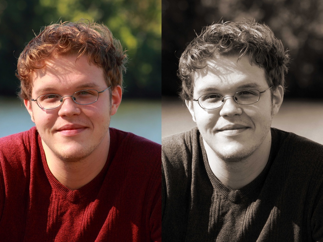
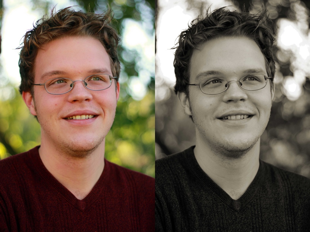
In the fall of 2012, my friend Timothy Stobierski asked me if I could take a headshot of him for the author biography page of a book of poetry that he had written called, Chronicles of a Bee Whisperer. I was happy to take the photo, as it is a cool thing to have a photograph that I took published in a book! So we went down to a local park and I snapped about 50 photos and narrowed it down to ten photos for him to choose from. It was further narrowed down to two photos which I then converted to black and white. Neither photo has a wildly distracting background and so the focus is led straight to Timothy's Face. We ended up agreeing on the second black and white shot because the light is much softer on his face and shirt than the first one is. Without the harsh shadows on his face, it looks much smoother, and since his shirt has softer light on it, it does not distract from the main focus...Timothy. He is not facing the camera dead-on in the second one either; his shoulders are slightly angled which allows for a better photo.
|


 RSS Feed